How to Get Investors to Engage With Your Emails
Written by Dave Bailey

Here's an example email template you can use to create investor updates. It uses visuals and text in a way that's easy for busy people to read!
I receive a lot of monthly update emails from CEOs I’ve invested in. It takes real discipline to update stakeholders regularly and I admire those founders who keep it up.
While I do open all the updates I receive, I must make a confession: when I see huge blocks of text, I read the first line — to check if something serious has happened — and then scan quickly through the rest for relevant requests for help. In other words, I don’t fully engage.
Many investors have admitted the same thing to me.
Often, they don’t seem too concerned about it; they’re just happy that the founder has a point of accountability, and that the information is there for reference, if needed.
However, this should be of concern to founders. Even if you can write prose like Hemmingway, blocks of text are scary for anyone to engage with. And the payoff for sending engaging investor updates can be huge.
When an investor truly engages with your content, they’re more likely to help you in the areas where you need it, and to remember you when it matters. Sending updates to prospective investors is also a great way to market your business and build relationships before you start your next round.
But what makes some updates more engaging than others?
Learn new skills every week ->
How to Write an Engaging Investor Update
While preparing this article, I went through dozens of my most recently received company updates to look for clues about what engaged me. The pattern was so simple that it was hidden in plain sight:
Less text, more pictures
The best updates showed me what was happening in the business, rather than telling me about it in large blocks of text. Visuals can drastically increase engagement, and they don’t have to take a lifetime to create.
That said, not all visuals engage. A founder who uses an abundance of emojis and cute GIFs from Giphy often comes off as naive, if not clueless. You don’t want to look like an amateur, so here are some ways to make your investor updates irresistible to readers.
1) Add your logo at the top
Branding your investor update is a sign that you take the update seriously. If you continually write great updates, the familiar logo at the top of the email signals that what’s to come is high quality.

I’ve seen founders add big vertical logos that take up two-thirds of the space above the fold in the email, but you don’t want to go crazy. A horizontal version of your logo is a better fit here.
2) Present a dashboard of metrics
Following a quick hello and introduction, I’d recommend leading with your metrics. Few things signal ‘good manager’ more than a beautiful table of the most important 3–5 metrics guiding your decisions.
Many founders use prose to present metrics, but this just makes it more difficult and time-consuming to read. Tables are more efficient and easier on the eye. For example:

I designed this table using this Google Sheets Table Template, and used Ctrl+Shift+4 to take a screengrab. Feel free to adapt the template by changing the labels, numbers, and colours as necessary.
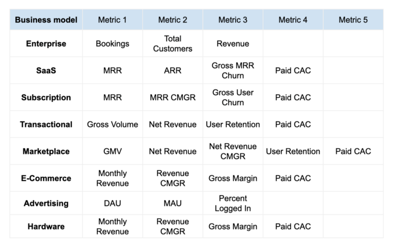
Which metrics should you choose? Anu Hariharan from YCombinator created a great video about which metrics to present, based on your business model. Here’s a quick summary:

3) Make clear and actionable requests
Asking something of your reader is a call to action — one of the best ways to measurably increase engagement. Calls to action are routinely buried at the bottom of an update email, but if your goal is to increase engagement, it’s worth putting them much higher up.
This is one place where text is ideal — but I’d recommend streamlining each request to fit on one line. If you need three lines to make a request, you risk losing the reader’s attention, so it’s worth rewording it to express yourself more directly.
Aside from being concise, a good request is clear, specific, and easy for your reader to action. Consider the following:
- ‘We’re looking for a CTO. Any help would be great.’
This request is so broad that it’s not clear what help is actually needed. Don’t make your reader guess — spell out what you’d like them to do. For example, you might say:
- ‘Please, could you share your experience in choosing the right CTO?’
- ‘Please, could you share any data on CTO salaries?’
- ‘Please, could you recommend a headhunter to help us find a CTO?’
Advice, data requests and ideas are frequently overlooked, yet investors often have all three in abundance. Making it easy for people to help you in the first place increases the odds of them helping you again. This is known as the Ben Franklin effect.
Making it easy for people to help you in the first place increases the odds they will help you again.
Learn new skills every week ->
4) Update using charts, product GIFs, and photos
There are many ways to structure the update itself. Some founders structure according to areas of the business, while others group things into wins and fails. However, the groupings are usually less important than the content itself.
The more points you can make visually, the better. With the right visual, you only need a short sentence or two to highlight what you’ve learned. A good learning usually contains:
- What you expected to happen
- What actually happened
Teaching your readers something new will increase the chances of them coming back for more.
Here are a few examples of easy-to-create visuals.
a) Have a particular issue to flag up?
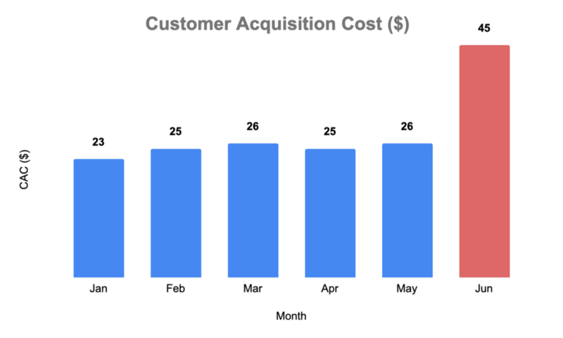
Present the issue in terms of numbers — for example, a chart showing increasing customer acquisition costs over the last month; you can explain the issue with a single sentence under the chart.

Last month, CAC increase by 70% while we experimented with billboards.
b) Recruited a superstar to the management team?
Take a photo with the new team member, or use a screengrab of their LinkedIn profile.

c) Hit a team milestone or moved to a new office?
Add a team photo. It’s also a great excuse to take regular photos, which are fun to look back on.

https://unsplash.com/photos/cMG5qjpnsyg
d) Got a new product feature?
Demo the feature using a GIF. Professional tools like ScreenFlow are designed to help you do this. Alternatively, you can make a mobile product GIF for free by using the screen recording feature on your smartphone and the Screen Frame Maker app to generate the GIF with an iPhone frame. For desktop product GIFs, you can use Loom to record the video and Veed's free GIF tool to convert it. Check out this recent GIF from the email client, Superhuman:
e) Hiring for multiple roles?
Create the org chart on a sheet of paper and highlight the open positions. I often make a sketch on my notepad, take a photo, and simply fiddle with the brightness and contrast until the background goes white.

Note: A good update will take some time to write. In practice, you’ll draft it and then ruthlessly edit it to be concise and informative. Teaching is a great way to solidify your own learning, so taking the time to really crystalise what you’ve learnt can pay off.
5) Include a gratitude list
Writing a list to thank the people who helped you last month comes with a number of advantages. Regular gratitude offers scientifically-proven benefits, such as improved physical and psychological health, mental strength, and even better sleep.
And gratitude lists can be engaging for the reader too. They show how well the founder is building relationships and which investors are helping out — and, of course, it makes me want to make it onto the list too! There’s nothing like a bit of social pressure to motivate action.
Through Good Times and Bad
It’s easy to write updates when things are going well. But when the charts aren’t going up and to the right, that little voice in your head might try to convince you that you’re better off leaving it until the problems are fixed.
You have to ignore that voice.
If you’re silent and invisible, then no-one can help you. Be courageous and write the update, even when things aren’t going your way. An engaged reader might just end up giving you the lucky break you need.
Continue reading about Investors:
- Growing your startup business? Here’s a list of effective fundraising strategies for your startup.
- Need a pay rise? Learn how to increase your founder salary.
- Trying to increase your blog engagement? Read my latest tips for writing viral blog articles.
Originally published Oct 8, 2019, last updated Apr 9, 2024
Learn a new skill every week
Subscribe to my weekly newsletter and learn new skills and mental frameworks that make startup life easier.
Unsubscribe any time.


